Your performance charts can now answer questions they couldn’t before. How does this quarter compare to last year? When did Pinterest traffic actually take off? What happened around that spike in March?
This latest release brings four upgrades to the charts on your Home Dashboard and Content Detail View, and they work hand in hand.
Pick a time period in one click
We added more options to the quick picker for the time windows you actually use. You can now jump straight to:
- Rolling windows for 7, 14, 30, 60, and 90 days
- Calendar shortcuts for This Month, This Quarter, and This Year
- Past periods for any previous quarter or full year, back to when your site started collecting data
It is a small change that saves a surprising amount of clicking, especially when you are bouncing between “how did this week go” and “how is the year shaping up.”
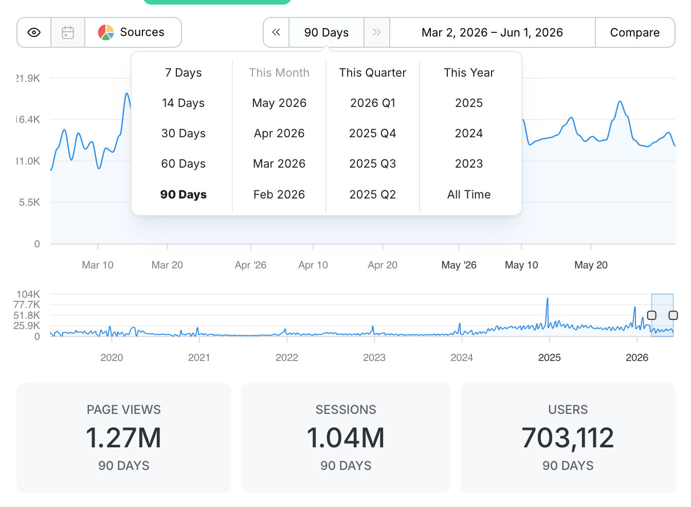
See how it compares
This is the upgrade we are most excited about. Once you have a time period selected, you can add a comparison line right on the chart. Pick Previous Period to see the stretch right before, or pick a specific year to compare against the same dates one, two, or several years back.
The comparison shows up two ways. It draws as a second line on the chart so you can see the shape of the difference at a glance, and it updates the Statistics Cards below with the comparison totals and the percent change. Green when you are up, red when you are down, no math required.
So when you look at This Quarter vs 2025 Q2 and the cards tell you page views are down 36 percent, you are seeing the full picture in one view: the trend line, the totals, and the change, all at once.

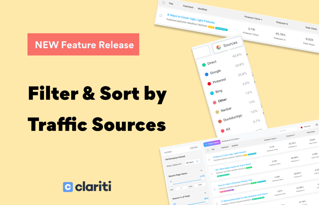
Chart a single traffic source
We recently gave you the ability to filter and sort your whole library by traffic source. Now you can bring sources to your charts too.
Open the source selector and pick any channel: Google, Pinterest, Direct, your email provider, and more. The chart redraws to show just that source’s traffic over your selected period.
Even better, this works with comparisons. Select a source and a comparison, and the chart plots that source against the same source a year ago, or against the previous period. So you are not just seeing “Pinterest traffic this quarter,” you are seeing “Pinterest this quarter vs Pinterest last year,” shape, totals, and percent change included. That is the difference between knowing a channel is up overall and knowing exactly when it moved and by how much.

A makeover for annotations
Annotations are how you mark the moments that matter: a recipe update, an algorithm shift, a viral moment, a note to your future self. We redesigned them so they are easier to find on the chart, easier to select, and easier to read at a glance.
We also added a Toggle Events button, located right next to the traffic sources toggle, so you can show or hide your annotations with a single click. When you want a clean view of the trend line, switch them off. When you want the full story behind the spikes and dips, switch them back on.

Available now
All four upgrades are live today for every Clariti subscriber. Time periods, comparisons, and source charting work on both the Home Dashboard and Content Detail View, and annotations are live on the Content Detail View now, with sitewide annotations on the Home Dashboard coming soon. Open either one, set your window, add a comparison, pick a source, and see your data in a whole new light.
Go take a look at how this year is stacking up. We love hearing how you are using Clariti to make smarter decisions about your content.
Not using Clariti yet? These upgrades are part of every plan. Start your subscription today and see your content business in a whole new light.
About the Author
Jen is the Associate General Manager at Clariti with a soft spot for great tech and good snacks. She has a Master’s degree in Human-Computer Interaction (which is a fancy way of saying she’s really into how people and tech get along). When she’s not working, you can usually find her hanging out with her family or baking something she’ll insist is “just a little treat.”