You’re not stuck with Google Analytics. Clariti provides a sound alternative to Google Analytics, so you aren’t left in the dark. Instead, head over to the Clariti app to effortlessly stay up-to-date on your performance, keyword ranking, and traffic sources, for your whole site and for every post.
Once you’ve connected your site to the Clariti app, we continuously pull the latest data from GA4 into an easy-to-navigate view in your Clariti dashboard. You’ll find performance data in two places: the Home Dashboard, for a view of how your entire site is doing, and the Content Detail View, for a deep look at any individual post.
Your Performance Chart
The performance chart sits front and center on both your Home Dashboard and the Performance tab of any post. It recently got a major upgrade, with four new ways to read your traffic.
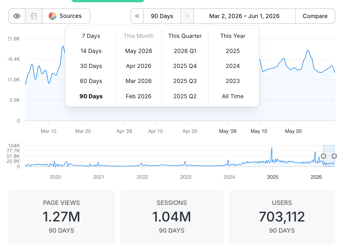
Pick Your Time Period in One Click
No more setting start and end dates by hand. Use the quick picker to jump straight to the windows you actually use:
- Rolling windows for 7, 14, 30, 60, and 90 days
- Calendar shortcuts for This Month, This Quarter, and This Year
- Past periods for any previous quarter or full year, back to when your site started collecting data (Note: GA4 often only allows us to pull in up to 2 years of data).
The chart and the Statistics Cards below it update instantly to match.
Compare Against Any Period
Add a comparison line right on the chart. Pick Previous Period to see the stretch right before, or pick a specific year to compare against the same dates one, two, or several years back.
The comparison draws as a second line on the chart so you can see the shape of the difference at a glance, and it updates the Statistics Cards with the comparison totals and the percent change. Green when you’re up, red when you’re down, no math required.
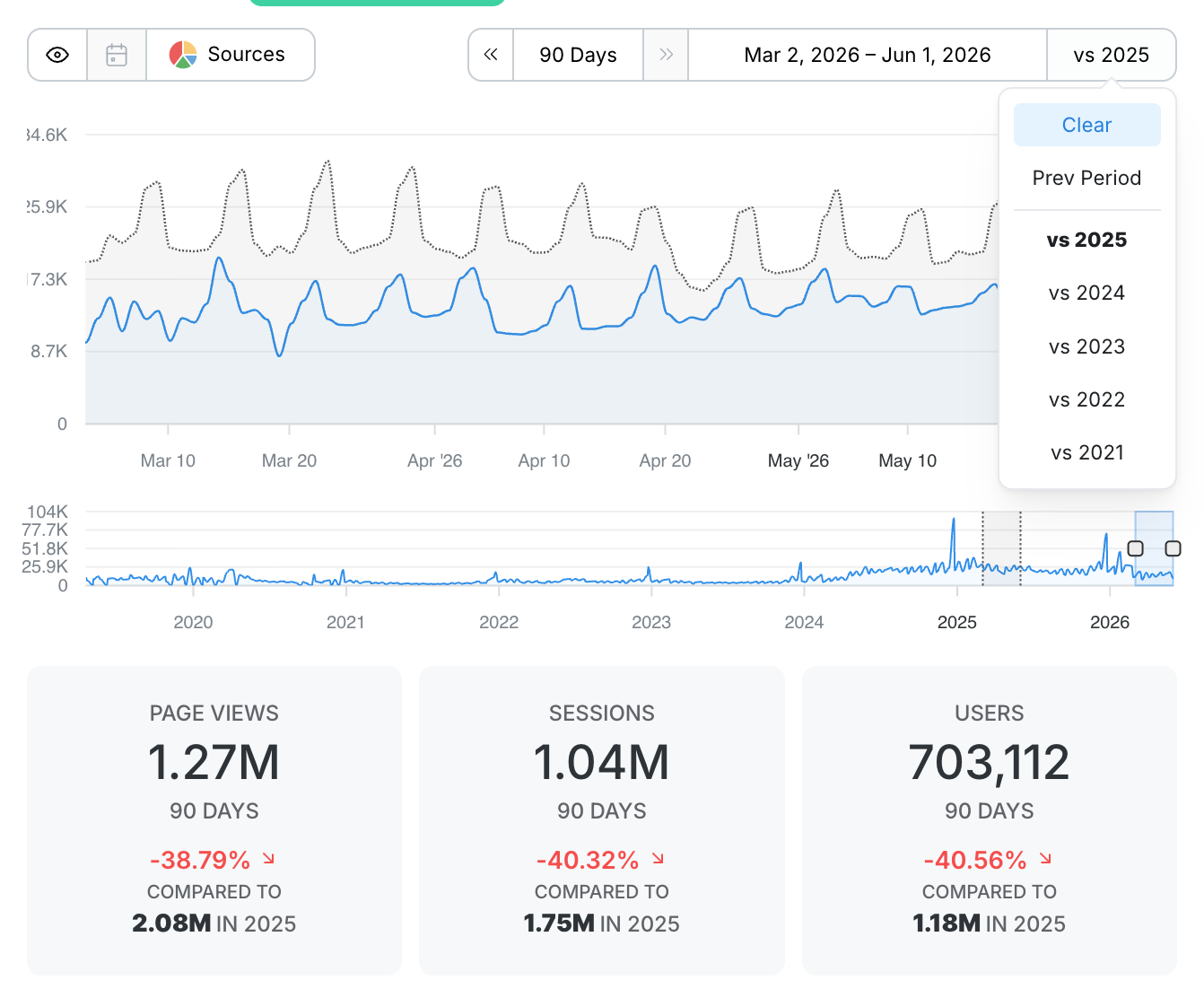
🪄 Clariti Tip! Set your window to This Year and compare against the prior year. It’s the fastest read on whether your content business is trending up or down over the long haul.
Chart Any Traffic Source
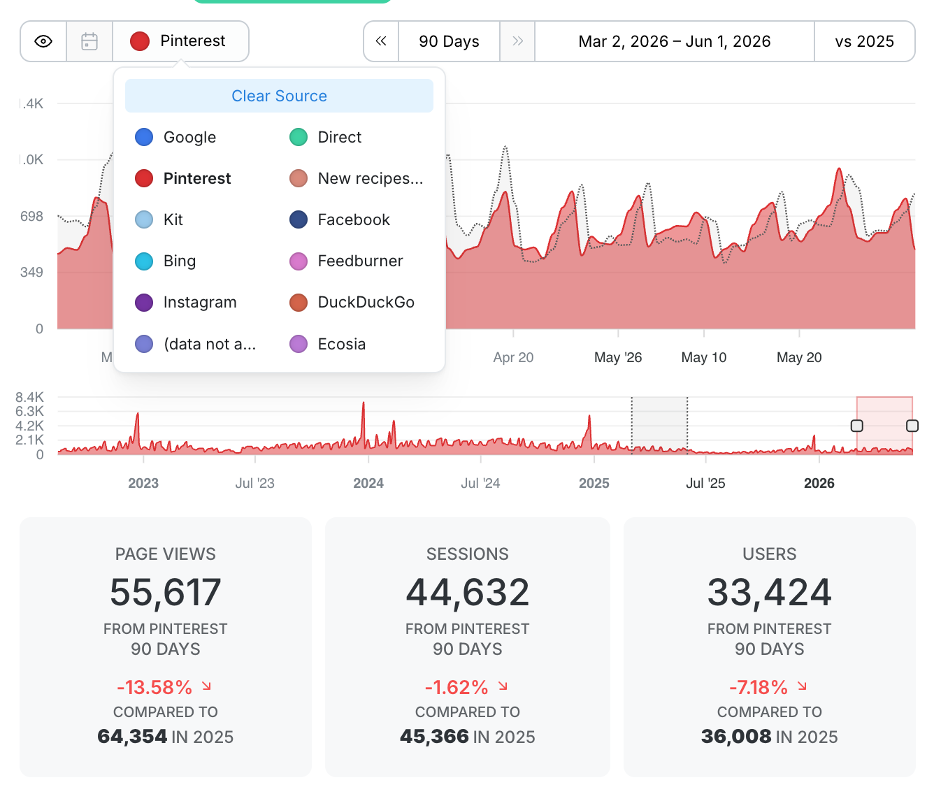
Open the source selector and pick any channel, like Google, Pinterest, Direct, or your email provider, and the chart redraws to show just that source over your selected period. Pair it with a comparison to see how a channel stacks up against the same source a year ago, so you know not just whether it’s up overall but exactly when it moved.
Mark the Moments That Matter
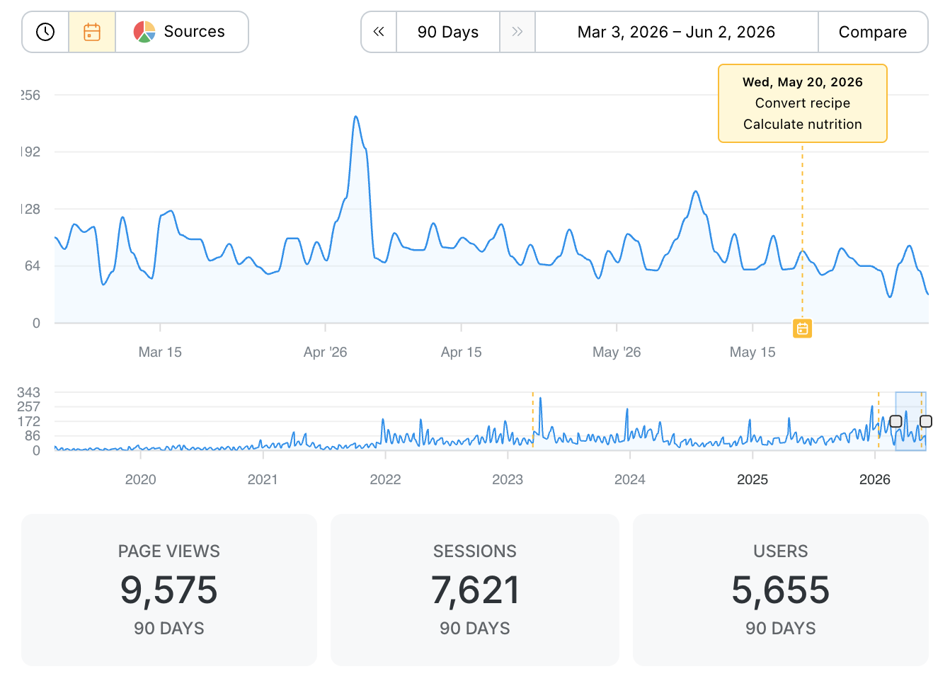
Annotations let you note the things that move your traffic: a recipe update, an algorithm shift, a viral moment, or a reminder to your future self. They’re designed to be easy to find on the chart, easy to select, and easy to read at a glance, and you can show or hide them anytime with the Toggle Events button next to the source selector.
See Where Your Traffic Comes From
Both the Home Dashboard and every post’s Performance tab include a Traffic Sources breakdown, so you can see what channels are driving the most traffic, what promotional efforts are the most effective, and where you need to spend a little extra time to boost your numbers. Each source is broken out by sessions or page views and its share of the total.

🪄 Clariti Tip! Seeing a dip in Pinterest traffic? Make a Pinterest reshare project and set a date as a reminder to share your post again soon.
Know How Readers Reach You
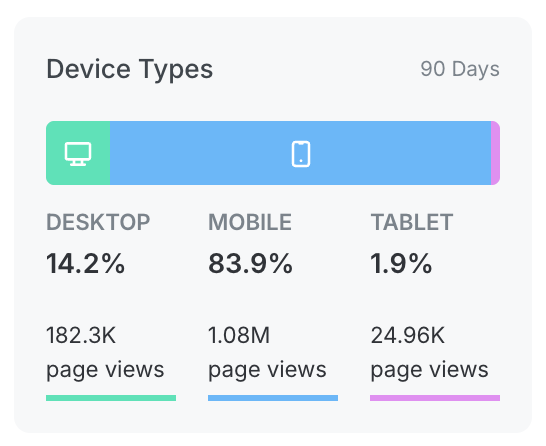
On a post’s Performance tab, the Device Types breakdown shows you the share of desktop, mobile, and tablet readers, along with the page views behind each, so you know how people are actually viewing your content.
Keyword Performance
On the Performance tab, chart how your post keywords are performing over time and quickly see every keyword your post is ranking for, with average position, clicks, impressions, and CTR for each. Want to track a specific term? Choose a Focus Keyword for your post.
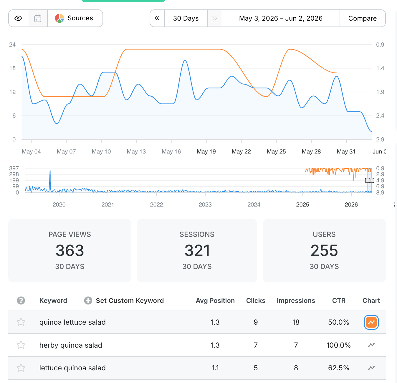
A Focus Keyword is the keyword or keyphrase that you’re trying to get your page to rank for most in Google results. When you select a Focus Keyword for your pages, Clariti will begin watching your search position for changes over time.
We have some exciting ideas for how to use keyword data to help you optimize your content, and selecting a Focus Keyword is just the first step!
Don’t see the keyword you’re hoping to rank for? You can also set a custom focus keyword.
See How Each Post Stacks Up
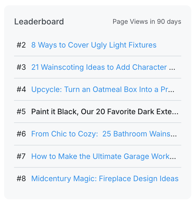
The Leaderboard lets you quickly see how any post is performing compared to the rest of the content on your site, and the Top Keywords summary surfaces what’s ranking for each post. It’s an instant gut check on where each piece of content lands in your library.
Learn how Laura and Sarah of Wandercooks use Clariti Analytics

After realizing that Clariti could help us stop relying so heavily on Excel and spending so much time in GA4, we decided to test it out. Now we have access to all our analytics in one place, and it’s made a huge impact on our workflow!